New Zealand Equine Industry Training Organisation
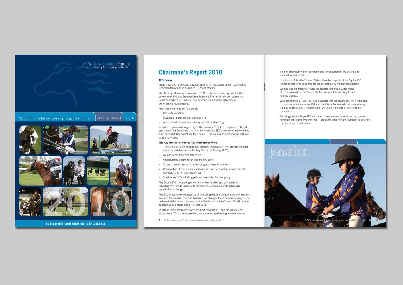
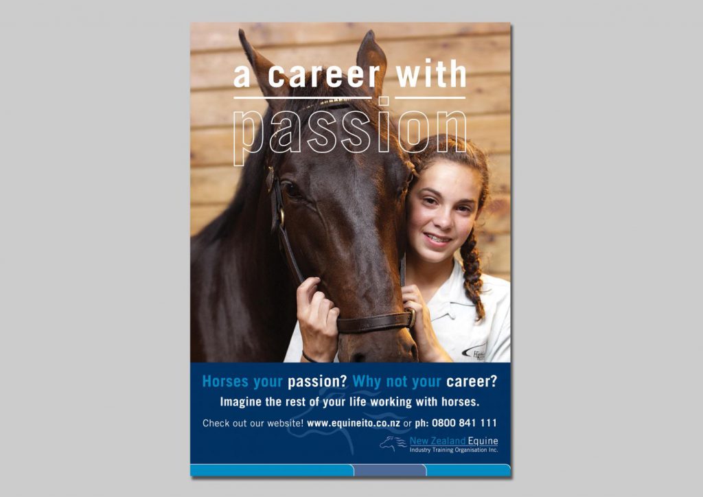
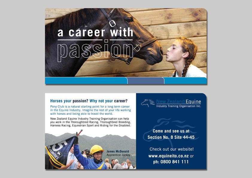
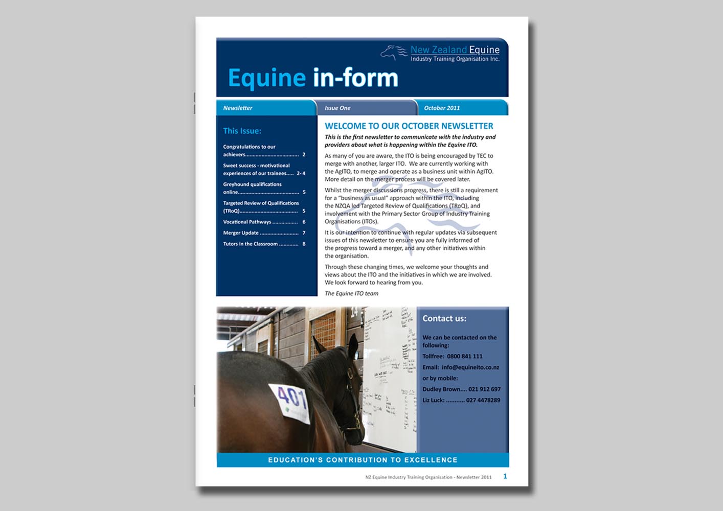
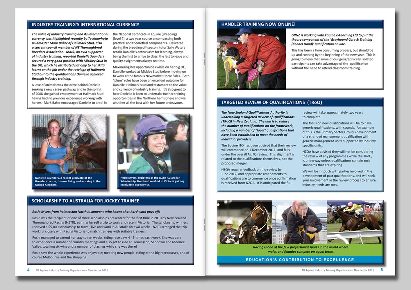
New Zealand Equine Industry Training Organisation (NZEqITO) is a training organisation that trains students to become jockeys, groomers, stable hands, groundskeepers and a variety of other careers. This project involved a total re-brand, the design projects included redesigning the logo, business stationery, promotional material and a large resource development project. The promotional material included designing industry overview brochures, posters, banners, booklets, annual reports and the website. The large educational resources project included designing the initial template and laying out the student workbooks, tutor workbooks and a tutor guide for over ninety unit standards.
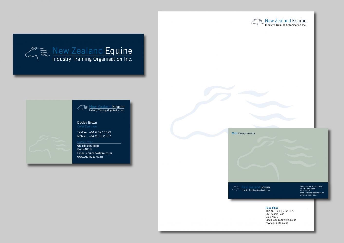
Project: Brand and Business Stationery Design.
Format: Business Cards, Compliment Slips, Letterhead, Company Profile Presentation Folder, Stickers and Signage.
Solution: I illustrated the horse head image and designed the logo and brand ‘look and feel’ which was consistently applied to the business stationery.
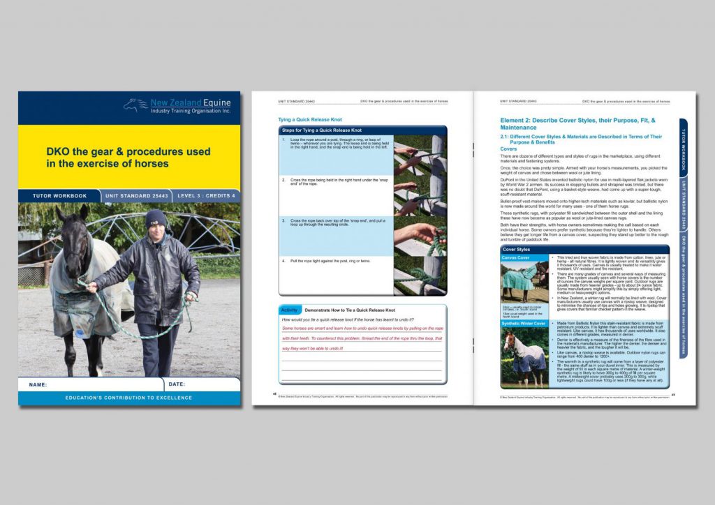
Project: Educational resource development.
Format: Full colour, A4 saddle-stitched Student & Tutor Workbooks and Tutor Guide booklets.
Solution: I was part of the resource management team that developed the educational resources for a large educational resource development contract. I designed the initial visual template and laid out the student and tutor workbook, and tutor guides for each unit standard. I designed the ‘look and feel’ of the resource materials. The end result was a professional workbook design that not only communicated clearly but were user-friendly and visually enticing.
“We appreciate all the hard work you have put into this project over the years and have been absolutely delighted by the quality of the workbooks and your attention to detail, which has resulted in outstanding product quality. We continually receive favourable comments about the workbooks from tutors, employers, students, industry and other providers, and we are all very proud of the project’s results. You have been an integral part of this process, and your commitment and follow-up have been outstanding.”
Sally Waters – CEO, New Zealand Equine Training Trust
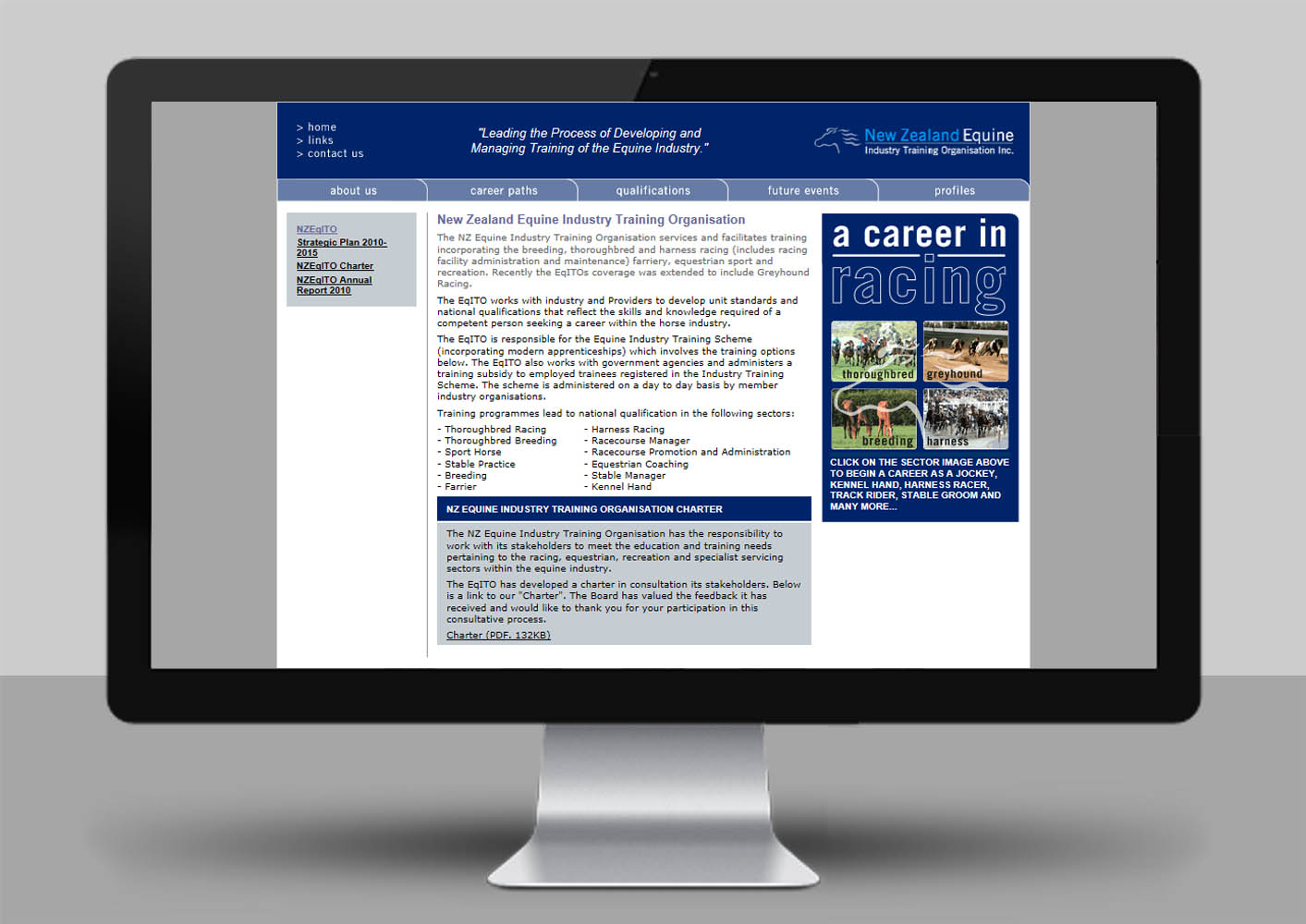
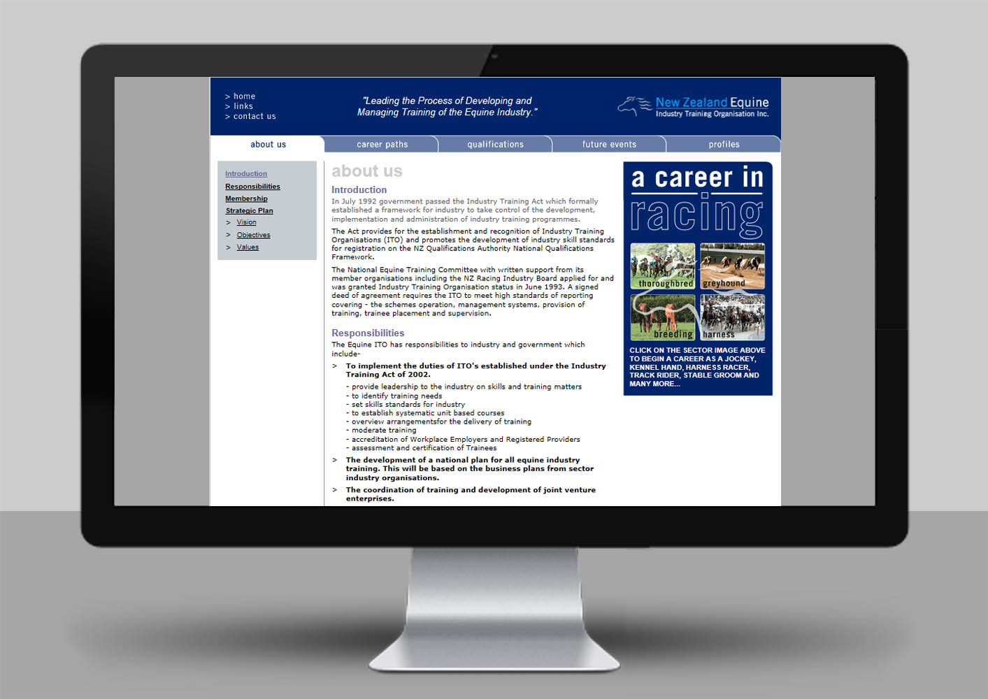
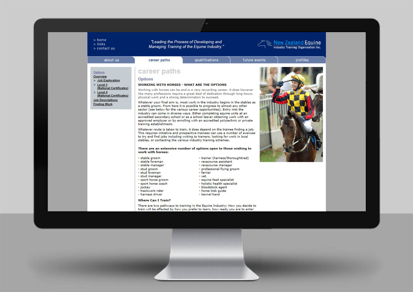
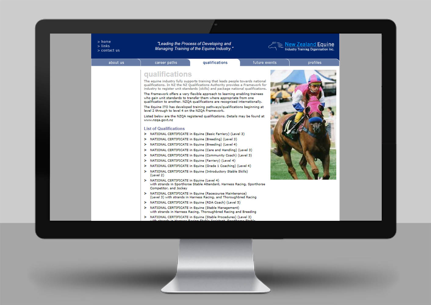
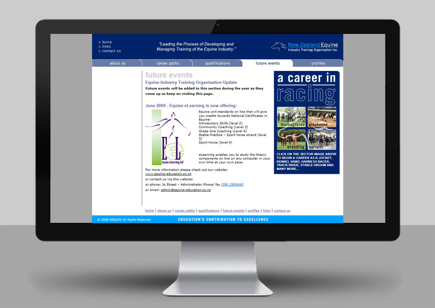
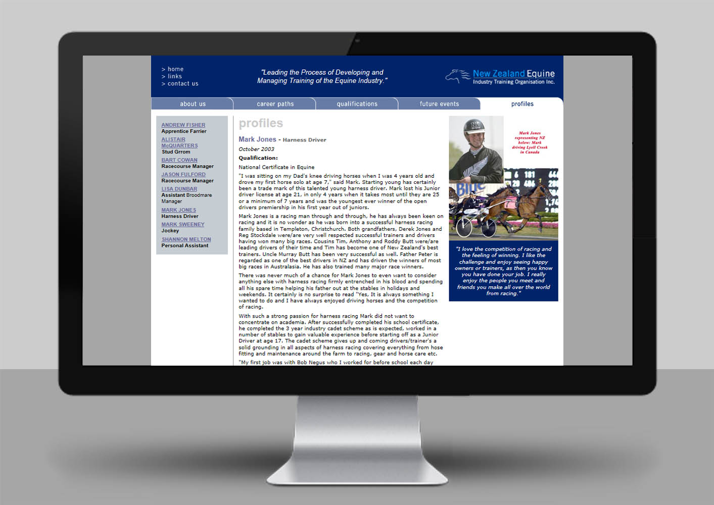
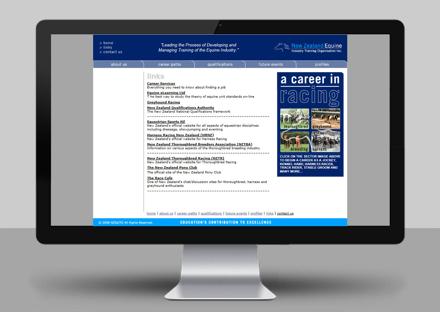
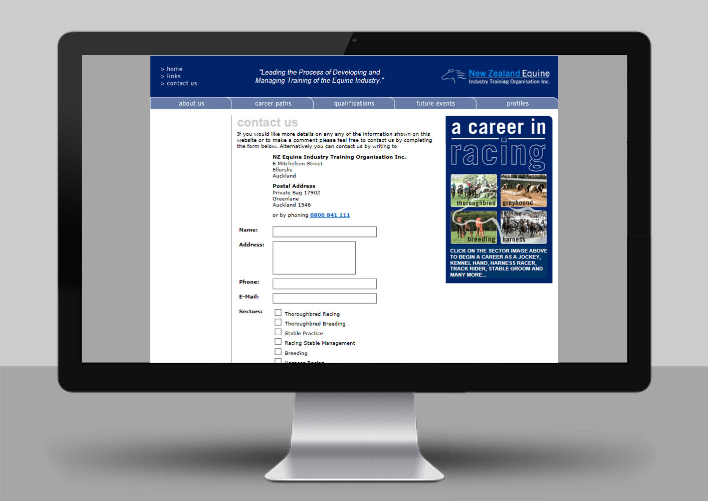
Project: Website.
Format: 20-page website with a secure login section.
Solution: I designed and built the 20-page website. The website contained a range of information including general information about the organisation, career paths for working with horses, job descriptions, qualifications, future events and profiles which contained eight profiles of young people in different careers in the racing industry. The look and feel followed the corporate brand using the same colours and fonts.

